


Empty
If you want to change that, support J\V.S and/or pick up some sweet goods, try some of the links below.


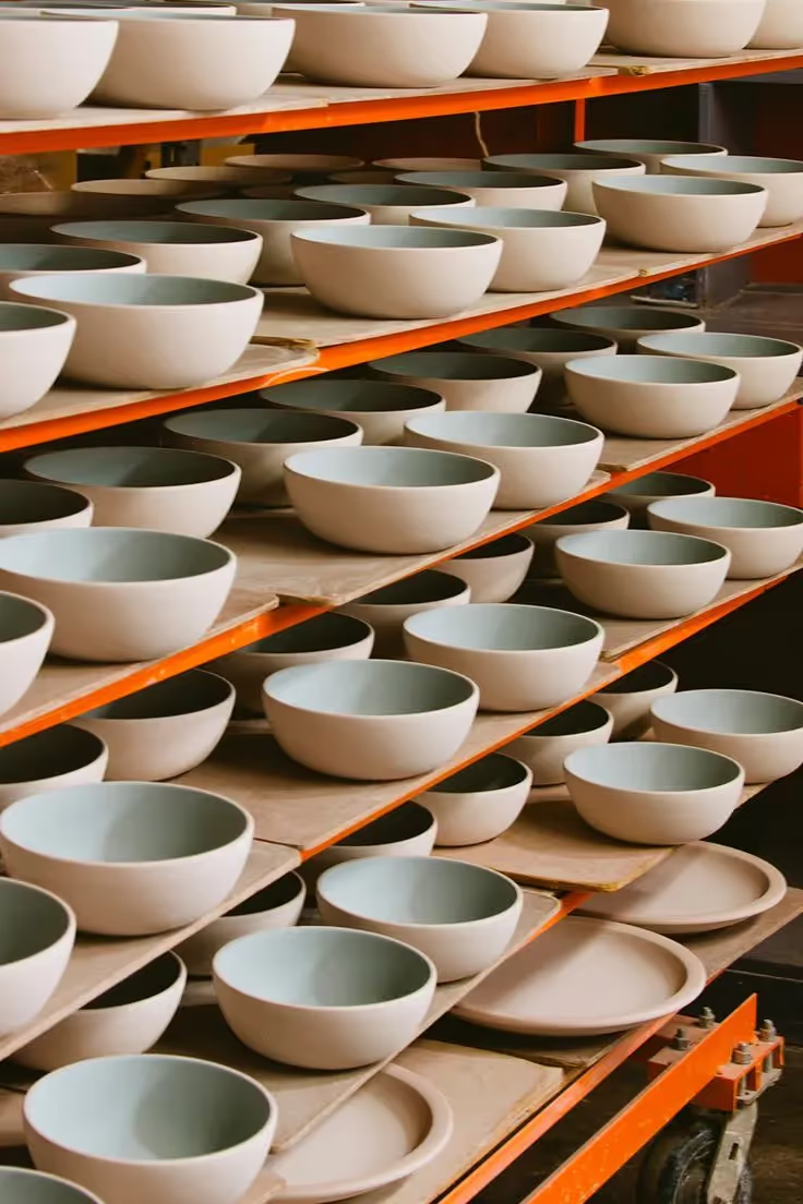
Oh there's no way I'm writing much of anything about this now. Basically another e-comm snooze fest sprint... I basically came on for a day or two to crank out some alt directions. As was typical with these kind of projects, I focused on different art directions with some baked in strategy/high-level thoughts about how they could convey their product lines. With these sort of pre-sales sprints, the idea was to represent an overall strategy that was based on various assumptions (some we couldn't possibly know), but showed strategic vision and an understanding of their brand.
For this one, I kept coming back to different ideas for layering and using panels as navigational elements. There was something about the layers found within their product that made this seems like a relevant, although admittedly thin allusion to the product. While I felt the end results were a nice evolution from their previous brand, there was something about the exposed product categories that felt like an interesting idea. In the end, not much besides that layered panel approach made it live as the site was completed after leaving BASIC.


